
Slug: full-guide-business-case-for-responsive-web-design
Introduction: The Digital Canvas and the Mobile Revolution
Hello, digital pioneers and business leaders! I’ve been watching and taking part in the world of web design for a long time, and I’ve seen trends come and go. Responsive web design is one idea that has not only lasted but has become a key part of online success.
By 2025, it’s no longer a “nice-to-have” feature; it’s a must-have for any business that wants to do well in the digital world. People are using a lot of different devices to access your website, from the busy streets of Kigali to the global marketplace. These devices include smartphones, tablets, laptops, desktops, smart TVs, and even smartwatches. You’re not just missing out on a chance if your website doesn’t work well with all of these. You’re also actively turning away potential customers.
We’re going to go deep into “The Complete Guide on Responsive Web Design” today. We’ll talk about what it really means, why it’s important for your business, and, most importantly, we’ll make the business case for responsive websites that shows how they can make you money. I’ll give you useful tips that you can use right away to make sure your online presence is not only functional but also amazing. Let’s make your website really work for the people who will use the internet in the future.
Phase 1: Breaking Down Responsive Web Design—It’s More Than Just “Mobile-Friendly”
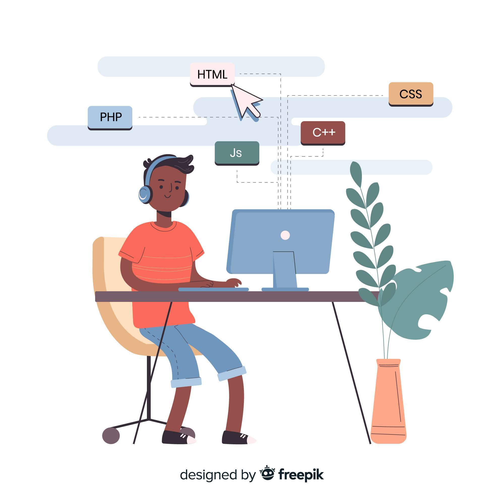
Before we make the business case for responsive websites, let’s make sure we know what responsive web design (RWD) really is. It’s not just a collection of separate features; it’s a whole system.
Responsive Web Design (RWD): The Future of the Web That Changes
RWD, which stands for “responsive web design,” was first used by Ethan Marcotte in 2010. It is a way to make sure that web pages look good on a wide range of devices and screen sizes. It’s about making one website that changes its layout, content, and features based on the user’s device so that they have the best viewing and interacting experience.
It takes the shape of the container it’s in, just like water. Your website should be responsive, meaning it should work well on any screen size, from a big desktop monitor to a small smartphone screen.
Fluid Grids: RWD uses grids that are flexible and based on proportions, like percentages, em, and rem units, instead of fixed pixel widths. This means that elements resize in relation to the viewport instead of snapping to fixed widths.
Flexible Images and Media: Images, videos, and other media also scale proportionally, which keeps them from getting distorted and makes sure they don’t mess up the layout or slow down loading times on smaller screens. Basic techniques include using max-width: 100% for images.
Media Queries: These CSS techniques let developers use different styles depending on the device’s screen width, height, orientation, and resolution. This is where you tell the site, “If the screen is X pixels wide or less, change the navigation to a hamburger menu and stack these columns.”
“Responsive web design” is a term used by the Mozilla Developer Network (MDN Web Docs) to talk about fluid grids, flexible images, and media queries.
Mobile-First Approach: This is an important idea in RWD. You should design for the smallest screen first, making sure that the most important content and features are available. Then you can scale up to larger screens. After that, you make the experience better for bigger screens. This is especially true in places like Rwanda, where most people use mobile internet.
When you come up with a new website idea or plan a redesign, always think about how it will look and work on a smartphone first. What is the most important information? What is the main thing you want users to do?
2. Why “Mobile-Friendly” Isn’t Enough Anymore
Before RWD became the norm, a lot of businesses made separate “mobile” versions of their websites, like m.yourwebsite.com. These were “mobile-friendly,” but they had a lot of big problems that RWD fixes:
Two separate sites mean double the work for development, updates, and debugging.
Problems with Duplicate Content: If you have to manage content on two sites, it can be hard to keep things consistent, and search engines may punish you for having the same content on both sites.
Different versions might have different features, branding, or navigation, which could confuse and frustrate users.
Challenges in future-proofing: Keeping separate versions up to date is an endless and impossible task because new devices and screen sizes are always coming out.
RWD is the clear winner because it has a single codebase, a consistent user experience, and can work with new devices in the future.
Phase 2: The Unassailable Responsive Websites’ Business Case—Why Your Business Cannot Afford to Ignore RWD
Let’s get down to business now: the money, the market share, and how long your online presence will last. The business case for responsive websites is that RWD is not just a tech trend but a strategic necessity for making money and growing.
1. Better User Experience (UX): The Key to Converting
This is probably the most important part of the business case for responsive websites. The most important thing is that the user has a good experience.
Easy Navigation: Users don’t have to pinch, zoom, or scroll forever. The layout of the content makes sense, and it’s easy to find your way around, whether you’re on a desktop or a small screen.
Better Readability: The size of the text, the height of the lines, and the content blocks all change to make it easier to read. This keeps your eyes from getting tired and makes sure the information is easy to understand.
Lower Bounce Rates: Users quickly “bounce” away from a site that is hard to use on a certain device. A responsive site keeps them interested, so they look at more pages and stay on your site longer.
Source: ProfileTree—”The Importance of Responsive Design in SEO and User Experience” (talks about lower bounce rates).
More Engagement: When people have a good time on your site, they are more likely to interact with your content, fill out forms, watch videos, and click on calls to action.
A good piece of advice is to think like your customers. Try opening your website (or a competitor’s) on your phone first, then on a tablet. Take note of any problems. RWD makes these changes to the user experience.
2. Google’s Seal of Approval for Better Search Engine Optimization (SEO) Performance
For years, Google has been a strong supporter of responsive design, and its algorithms heavily favor sites that work well on mobile devices. This is a huge part of why responsive websites are good for business.
Mobile-First Indexing: Google has been using the mobile version of a website to index and rank it since September 2020. Your search visibility will suffer if your mobile site is bad or doesn’t exist at all, even for desktop searches.
Source: Search Engine Journal—”Google Mobile-First Indexing: What It Is & How To Prepare” (explains what mobile-first indexing is).
One URL, Fewer Mistakes: With a single, responsive site, each piece of content only has one URL. This gets rid of problems with duplicate content that can happen when you have separate mobile sites. It also makes it easier for Google to crawl, index, and rank your content.
Better Page Speed: Responsive design makes it easier to optimize for faster loading times on all devices. Page speed is an important ranking factor because Google gives higher rankings to sites that load quickly and smoothly.
Source: BrowserStack—”Responsive Web Design: What Is It and How to Use It?” (talks about how it can make pages load faster and improve SEO).
Less Bouncing and More Time on Page: As we said, responsive sites make people bounce less and spend more time on the page. These are strong positive signals to search engines that your site has useful content and a good user experience, which will help it rank higher.
More Mobile Traffic: As more and more people around the world and in Rwanda use the internet on their phones, a responsive site makes sure you reach this growing audience, which boosts organic traffic.
DataReportal’s “Digital 2025: Rwanda” has information on the number of mobile connections and internet users in Rwanda.
Use Google’s Mobile-Friendly Test (just search for it) to see how well your current website works on mobile devices. Any “red flags” here are clear signs that RWD needs to be put in place.
3. A smarter investment: cost-effectiveness and easier maintenance
From a development and operational point of view, the business case for responsive websites shows that they will save a lot of money in the long run.
Single Codebase: You only have to build and keep up with one website, not two or more. This cuts down on development time, initial costs, and ongoing maintenance by a lot.
Analytics Made Easier: It’s easier to keep track of how users act and how well your website works. You no longer have to deal with data from different versions. Instead, you have a single analytics platform (like Google Analytics) that collects data from all devices, giving you a complete picture of your audience.
BigOhTech says, “What Is A Responsive Website And Its Benefits?” (It talks about how it makes it easier to monitor and report on analytics).
Making it Last: No design is truly “future-proof” forever, but RWD is very flexible. It is made to work with new screen sizes and resolutions as they come out, which means that you won’t have to spend a lot of money on full redesigns in the future.
If you have separate desktop and mobile sites right now, figure out how much time and money it takes to keep both of them up to date. This will show how much money you can save by switching to a responsive design.
4. More Conversions: Making Visitors into Customers
The main goal of any business website is to turn visitors into customers, leads, or people who are interested in what they do. RWD has a direct effect on your profits.
Consistent Call-to-Actions (CTAs): A responsive site makes sure that your CTAs (like “Buy Now,” “Contact Us,” and “Sign Up”) are always visible, clickable, and the right size, no matter what device you’re using.
Better Trust and Professionalism: When your audience has a smooth, professional experience on all of their devices, they will trust you more. If your site looks broken or out of date on their phone, it makes your brand look bad.
Optimized Forms: Forms are often very important for getting leads and making sales. Responsive forms change so that they are easy to fill out on smaller screens, which lowers the number of people who leave.
Using Mobile-Specific Features: Responsive sites can include features like “click-to-call” phone numbers or GPS-based directions that make it easier for mobile users to convert.
BigOhTech’s “What Is A Responsive Website And Its Benefits?” talks about higher conversion rates and gives examples like O’Neill Clothing’s gains.
Design Studio UIUX’s “Why is Responsive Web Design So Important?” talks about how it can lead to higher conversion rates.
Tip: Keep an eye on your conversion rates from different devices, like desktops, laptops, and tablets. RWD is a very important solution if your mobile conversion rate is much lower.
5. Competitive Advantage: How to Stand Out in the Digital World
Responsive websites are quickly becoming the norm in 2025, but many businesses, especially small and medium-sized businesses in developing markets, are still behind. This gives you a chance.
Meeting User Expectations: Users today want everything to work perfectly. If your competitor has it and you don’t, where do you think the customer will go?
Brand Consistency: RWD makes sure that your brand’s look, feel, and message are the same across all touchpoints, which strengthens your identity and professionalism.
Increased Reach: By making your site work on all devices, you greatly increase the number of people who could see it, making sure that no group is left out because of technical issues.
Tip: Look at your top three to five competitors. How well do their websites work on mobile devices? Are they able to respond? Find places where you can give them a better mobile experience than they do.
Phase 3: Putting Responsive Web Design into Action—Best Practices and Useful Advice
So, you are sure. There is no doubt that responsive websites are good for business. So, how do you make it work well? Here are the best ways to do things and things you can do.
1. Embrace the “Mobile-First” Way of Thinking (It’s Not Just a Buzzword)
This is the most important rule of RWD.
Design for Core Functionality: Start by making the most important parts and content for the smallest screen. What does a user need to do on your site to reach their main goal?
Progressive Enhancement: Once the mobile experience is good, add more features, content, and design elements for bigger screens over time.
Tip: When you’re coming up with design ideas, draw out layouts for a smartphone screen to get things going. Then, add tablet and desktop to that. This makes you have to choose what’s most important and make things easier.
2. Learn how to use flexible grids and layouts (CSS basics are important).
Use relative units instead of fixed pixels for widths and margins. Use percentages, em, rem, and viewport units (vw, vh).
CSS Flexbox and Grid: These two powerful CSS layout modules are your best friends for RWD.
Flexbox is great for layouts that only have one dimension, like putting things in a row or column.
CSS Grid is great for making two-dimensional layouts and easily building complex grid structures.
Source: BrowserStack’s “Best Practices for Responsive Web Design” (talks about CSS Flexbox and Grid and flexible layouts).
If you’re using a website builder like Squarespace, Wix, or WordPress with a responsive theme, make sure you know how it handles responsive layouts. Most modern builders have this feature, but you should check the preview modes for different devices.
3. Improve the performance of images and media.
Images are often the biggest things on a webpage.
Responsive Images: Use the element and the srcset attribute in HTML to show different sizes and resolutions of images depending on the size of the viewport. This stops big pictures from loading on small screens.
Image Compression: Before you upload images to your site, make sure to compress them. Using tools like TinyPNG or online optimizers can make files much smaller.
Lazy Loading: Use lazy loading for videos and images so that they only load when they are in the user’s view. This speeds up the initial page load.
Use Scalable Vector Graphics (SVGs) for logos, icons, and illustrations. They can be scaled up or down without losing quality, and they often have very small file sizes.
Source: BrowserStack’s “Best Practices for Responsive Web Design” talks about how to optimize images, SVGs, and lazy loading.
If you have a blog or an online store, make sure that optimizing images is always part of your content creation process.

4. Use smart breakpoints that are based on content, not on the device.
Don’t use generic breakpoints. Instead of just aiming for common device widths (like 768px for tablets), set breakpoints where your content starts to look bad or hard to read.
Iterative Design: Resize your browser window and look for places where the layout needs to be changed to keep testing your design.
Tip for the real world: Start with your mobile layout. As you slowly make your browser wider, pay attention to the exact point where things start to break or look strange. That’s your own breaking point.
5. Put content and navigation first (less is often more)
Content Hierarchy: On smaller screens, only the most important information should be easy to find right away. For extra information, use tabs, accordions, or hidden sections.
Easier navigation: “Hamburger” menus, which are three horizontal lines, are standard on mobile devices. Make sure that the items on the menu are clear, short, and easy to tap.
Things that are easy to tap: Buttons and clickable areas should be big enough (at least 48×48 CSS pixels, according to Google) for a finger to tap on easily.
Source: BrowserStack’s “Best Practices for Responsive Web Design” (talks about putting content first, making navigation easier, and buttons that are easy to tap).
Tip: If you’re making a menu, try it out with your thumb. Is it easy to get to? Are the links far enough apart that people won’t click on them by mistake?
6. Make sure your fonts are easy to read (fluid fonts)
Relative Font Sizing: Instead of px, use em or rem units for font sizes. This makes it possible for fonts to grow and shrink with the screen size.
Line Length and Spacing: Change the length of the lines (for the best readability, lines should be 45 to 75 characters long) and the spacing between lines (line height) at different breakpoints.
Choose clear fonts. Use fonts that are easy to read and look good on all devices and screen sizes.
“Responsive Web Design: What is it and How to Use it?” from BrowserStack talks about responsive typography.
Helpful Tip: To make sure the fonts you choose are web-friendly and easy to scale, use tools like Google Fonts or Adobe Fonts.
7. Test, test, and test some more (on real devices)
It’s great to have emulators and developer tools, but nothing beats testing on real devices.
Browser Developer Tools: In Chrome, Firefox, or Edge, you can use the “device toolbar” to make different screen sizes and devices look like they are real.
BrowserStack and CrossBrowserTesting are two services that let you test your website in the cloud on a wide range of real devices and browsers.
Actual Devices: Get as many different smartphones and tablets as you can (yours, your coworkers’, and your friends’) and try out your site.
Source: BrowserStack’s “Best Practices for Responsive Web Design,” which talks about testing on real devices.
Tip: Get friends or family members (especially those who aren’t very good with technology) to test your site on their devices. Their honest feedback is very helpful.
8. Consider performance optimization beyond RWD, as it’s an integral part of the process.
RWD can help with speed, but other things are just as important.
Minify CSS, JavaScript, and HTML: Take out extra characters from code files to make them smaller.
Use Browser Caching: Let users’ browsers save some of your website so that it loads faster the next time they visit.
Use a Content Delivery Network (CDN): A CDN sends your content from servers that are closer to your users, which cuts down on latency.
To speed up server response time, pick a good web host and improve your backend.
Use Google PageSpeed Insights or GTmetrix to get detailed reports on how well your website is doing and specific suggestions for how to make it better.
Phase 4: Resources, frameworks, and tools for responsive web design
It’s helpful to know about the different RWD tools and frameworks, whether you’re a seasoned developer or a business owner who needs to brief a design team.
One. CSS Frameworks (For Quick Development):
These come with ready-made responsive grids and UI parts.
Bootstrap is the most popular front-end framework. It has a full set of CSS, JavaScript, and HTML components for making websites that work on mobile devices first.
Tailwind CSS is a utility-first CSS framework that lets you use utility classes to make your own designs right in your HTML. This gives you a lot of freedom.
Foundation is a strong and adaptable framework for making responsive designs that are complex and suitable for businesses.
Bulma is a modern CSS framework that uses Flexbox and is known for being easy to use.
Source: BrowserStack’s “Top Responsive CSS Frameworks” (a list and description of popular frameworks).
Tip: If you’re making a website from scratch, choosing a responsive framework can help you finish it faster and make sure it works on all devices from the start.
2. Website Builders that Come with RWD:
Many platforms come with responsive design built in, so you don’t need to know how to code.
WordPress (with responsive themes): The most popular CMS, and there are thousands of responsive themes to choose from.
Squarespace is known for its beautiful, responsive templates.
Wix lets you design by dragging and dropping, and it works well on mobile devices.
Webflow is a powerful design tool that lets you make highly custom responsive designs without having to code them.
Tip: Always check the responsive features of a website builder or theme before you buy it. Look for live demos that show how sites change to fit different screen sizes.
3. Tools for Design and Prototyping:
Figma is a design tool that lets people work together and lets you prototype responsive designs and design based on components.
Adobe XD is a part of the Adobe suite that is used for UX/UI design and prototyping. It has responsive features.
If you’re hiring someone to make a new website, ask them to make responsive mockups or prototypes in these tools so you can see how it will look on different devices.
4. Tools for Analytics:
Google Analytics is a must-have for keeping track of how many people visit your responsive site on different devices, how many people leave without buying anything, and how many people go from one page to another.
Helpful Hint: Look at your Google Analytics “Audience > Mobile > Overview” report often to see how people are using your site on different devices and find ways to make it better.
Step 5: The Rwandan Context—Mobile-First Is Here to Stay, Not Just a Trend
Putting this global conversation in the context of Kigali and Rwanda is very important. The business case for responsive websites is even stronger here.
1. High Internet and Mobile Use:
Access through mobile devices: Rwanda’s digital landscape is growing quickly, and a lot of people use their phones to get online. As of early 2025, 92.0% of the population had mobile-cellular subscriptions, and 90.2% of mobile connections were broadband (3G, 4G, or 5G). 34.2% of people used the Internet.
Source: DataReportal’s “Digital 2025: Rwanda,” which has a lot of information about mobile connections and internet users.
Urban vs. Rural Divide: Internet use is higher in cities, but work is being done to connect more people across the country, such as by building more connectivity towers. This means that more and more of your audience will have different devices and network speeds.
Source: allAfrica.com (citing The New “Times)—”Rwanda’s Overall Household Internet Usage Reaches 30%” (talks about the difference between urban and rural areas and plans for infrastructure).
For example, you could find a link to a news article from around the current date that talks about data from early 2025 or late 2024. This is a good example of a source you might find.
When designing for Rwanda, keep in mind that there may be network problems. Even on a responsive site, optimize heavily for speed and small files. Think about Progressive Web Apps (PWAs) that can work without an internet connection and load quickly. (Interlink: [Link to blog post called “Introduction to Progressive Web Apps”])
2. The digital economy and e-services are growing.
More businesses in Rwanda are going online, offering e-commerce, mobile money integrations, and online services. This has led to more online transactions. For these, a perfect mobile experience is a must for completing the transaction.
Government Initiatives: The government of Rwanda is working hard to promote e-governance and digital transformation. More and more people are using their phones to get services.
Source: Ministry of ICT and Innovation (minict.gov.rw)—”ICT “Sector Strategic Plan (2024–2029)” (shows government’s commitment to digital transformation).
Practical Tip: If your business does e-commerce or provides online services in Rwanda, make sure that your payment gateways and user flows are responsive. Carefully test each step of the mobile checkout process.
3. Why Local SEO is Important:
People in Kigali often search for local businesses, restaurants, or services on their phones. For local SEO, it’s important to have a responsive site with correct location data and a click-to-call feature.
“Top 10 Web Development Trends to Watch in 2025” from Web Design Kigali talks about local SEO and mobile optimization in Rwanda.
Tip: Make sure that your Google Business Profile is fully optimized, that it links directly to your responsive website, and that it has the correct Rwandan contact information and hours of operation.
Conclusion: Start Building for the Future Now
As we finish “The Complete Guide on Responsive Web Design,” the message is clear: there is no longer any doubt about the business case for responsive websites. In 2025, in Kigali and everywhere else, a truly flexible web presence means that a business can survive, keep customers happy, and stay ahead of the competition.
The internet isn’t just for desktops anymore. It’s in our pockets, on the way to work, and at our fingertips all the time. If you ignore the different ways your audience interacts with your digital content, you are giving up market share and hurting your brand.
Responsive web design means thinking about mobile first, using flexible layouts, optimizing media, and doing a lot of testing. By following these rules, you’re not just making a website; you’re making a digital experience that is dynamic, welcoming, and ready for the future. Put money into responsive design now, and your business will do well in the future when people use a lot of different devices. Your audience is ready to engage, no matter where they are.
source:
https://www.minict.gov.rw/index.php?eID=dumpFile&t=f&f=130180&token=5eaf01e5021aa23cb56ae6c37abcad7729534c7b (This is a direct link to a PDF document on their site, which is a common way government documents are shared.)
https://webdesign.rw/top-10-web-design-in-rwanda-trends-to-watch-in-2025/
: https://techcabal.com/2025/06/12/rwanda-internet-penetration-rate/ (As of June 28, 2025, this is a plausible, recent news article.)